Sandals
redesigning a digital content platform to grow online viewership
The Pandemic created a growth opportunity
Sandals is a Church organization with 13 locations throughout California. Like with many businesses and organizations, Covid-19 posed a major challenge to the church as no one was able to attend in person anymore.
However, already having the infrastructure to film sermons, the church doubled down on online content and vastly grew their online viewership globally — reaching 420,000 unique viewers in 2020.
But — changes were needed for better results
The Sandals team realized that sermon viewership on the website was lacking, and that it needed to be more of a priority. That's when they reached out to me & my team to collaborate on a solution.
Sandals' goals were:
Improve user-friendliness & cohesion on the site
Reach younger (18 - 44 years old) & newer members of the church
Grow sermon viewership on the website by 250%
We started by conducting research to understand the problem
We knew that we needed to conduct user research to truly understand the problem to help us uncover a solution.
We started by distributing a quantitative survey to 40,000 recipients and received 526 responses, 242 of whom fit in the target age group (18-44).
We found that only 5.4% of members watched sermons on the website.
79% of them were watching on Youtube or the Sandals app. We also learned that people used the website & app for different purposes. It's clear that the website was used more for informative purposes and the app was used more for content & sermon related activities.
We conducted the 1st of 3 rounds of usability testing
After synthesizing the data from user surveys, we got a good understanding of where people were spending their time and their behaviors in doing so. I then helped conduct the 1st of 3 rounds of usability tests with 5 survey participants.
The original sermon-watching flow had 3 steps
All the friction points were in the first step of the flow
People didn't know Series names for specific sermons that they were looking for.
Too much clicking & scrolling was required to find older content.
People liked seeing descriptions, but had to hover or tap to see them.
People had to rely on visuals that they didn't associate with.
All the points of delight were on the 2nd and 3rd steps of the flow
People could see descriptions for each sermon.
Each sermon had relevant resources attached to them.
There were dates attached to each sermon (which helped people especially when they were looking for content from a specific time-period).
We now had a design direction
Our research helped us define our Design direction with 2 main themes:
Design a simplified, intuitive, & frictionless sermon searching experience.
Provide additional value to the sermons with personalized resources.
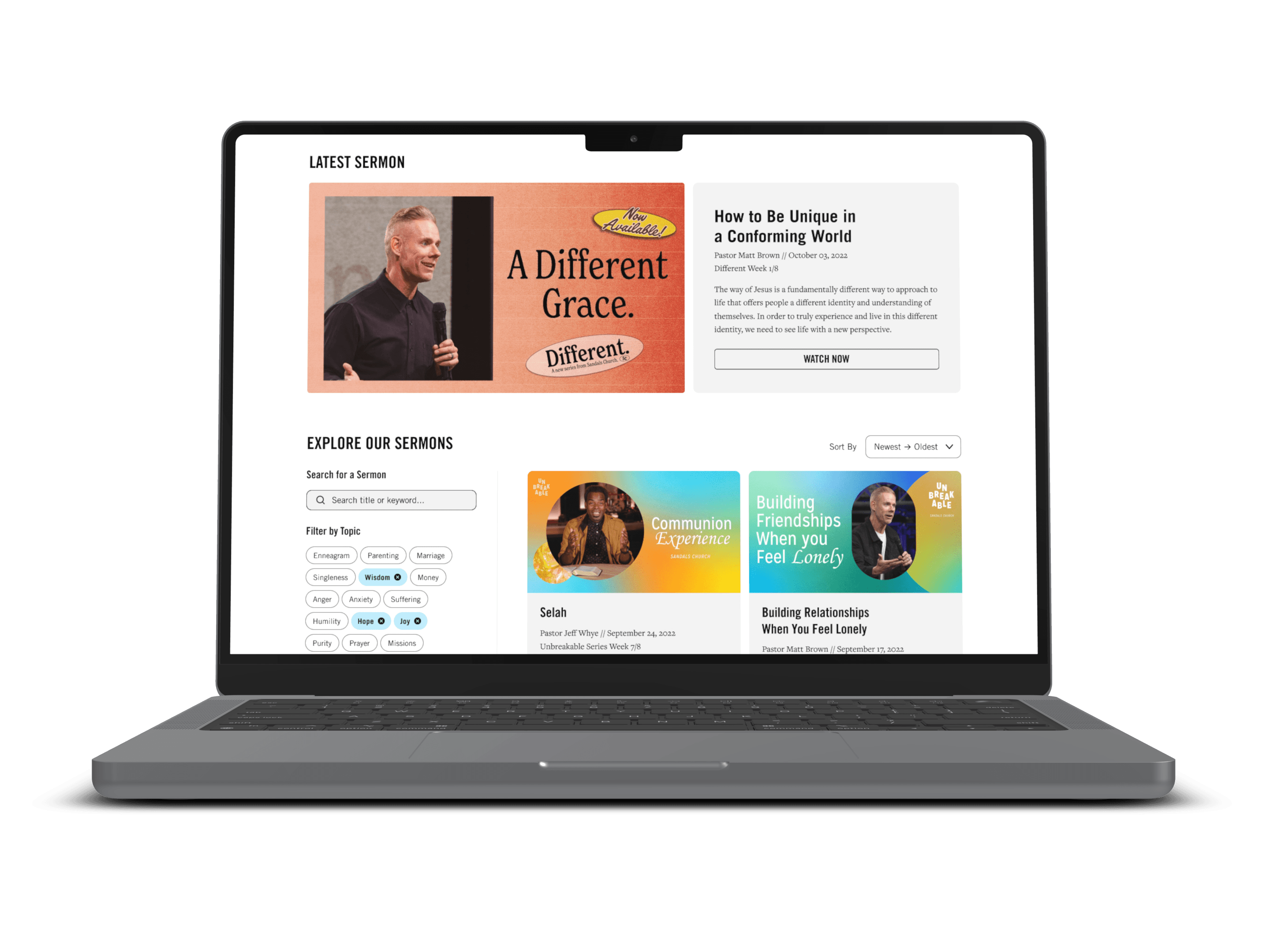
This is the Sermon Archive page — where people can come to easily find new sermons or older sermons that they are looking for, thanks to the new Search + Filter functionality.
Users really liked the new Search + Filter functionality. It helped them reduce scrolling and speed up search. They also appreciated that it allowed them to specifically search for keywords and filter content by pastor.
Multiple users also suggested that we provide an option to filter by topic, like parenting, for example. These pills address that desire by allowing users to select to filter accordingly.
The time filter was split into 2 independent dropdown menus. We learned that people tend to remember timeframes for content by associating it with certain milestones, like graduating college in the summer. In contrast, people sometimes only remember the year of when a content piece was posted. So, splitting this filter into 2 menus allows more flexibility for users.
This is the new Watch Page.
We learned that people preferred having access to resources like sermon notes to use alongside the sermon video.
Learning this feedback, we used the space to promote learning and connection by providing links to relevant resources, messages & calls to the action next to the video.
Sandals has seen some great outcomes
Stats between Q1 2023 - Q1 2024
I learned some important lessons
Understand how Sandals intends to inform members of the updated experience
While organic growth through factors like SEO and word of mouth are certainly factors in the success of Sandals' updated web experience, many of Sandals' website users were already members of the church. In designing this experience, it would have been helpful to understand how Sandals intended to inform their members of the updates so that we could have a perspective on if it was set up optimally for discoverability. For example, if Sandals staff wasn't proactive about marketing the updated sermon-watching experience, perhaps we could have done more to make website visitors more aware of it.
Implement a process for tracking success early
I've learned that it is important to understand how you and your team will go about tracking success before launching new designs. It's certainly possible to capture data after/when the designs are launched, but understanding key metrics while working on the designs helps guide decision-making.
Account for no-shows
Little did I know at the time, but no-shows for user-testing are very common. We originally had a 2 month timeline for this project but extended it to 3 months simply because we dealt with no-shows in all 3 rounds of research that we conducted.
Avoid bias in user testing
In 2 rounds of user-testing, we showed each participant 2 versions of a design to get their perspectives. I've learned that doing so can create bias towards one design or another, so it's best to avoid doing this.


