Indeed Interviews
redesigning indeed’s video interviews platform to help more people get jobs
What if we could increase the rate of successful job offers?
8 million interviews were being scheduled on our video interviews platform yearly, providing us many datapoints on its challenges & opportunities.
How might we build advanced features users want?
Rebuilding the platform on a new SDK enabled us to address these problems
If we could directly tackle the connection issues contributing to no-shows & missed connections, build certain features we were limited from previously, and enable a more modern experience — we would be able to create a more intuitive and user-friendly experience for job seekers and employers.
Our project roadmap kicked off with the design and build for our MVP (feature-parity with the existing version of the platform) so that we could test and ensure it’s viability with our high-volume of users.
Later stages included things like feature exploration, UXR, and building the Webinar functionality within Indeed’s E2E experience.
Mobile optimized with job seekers in mind
While the majority of interviewers used the desktop experience, most of the job seekers attended interviews on their phones. In the redesign, I crafted a mobile experience that would seamlessly work around job seeker needs.
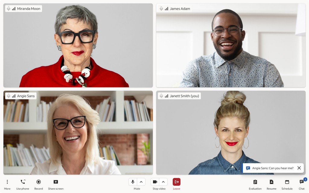
A toolbar and side panel specifically designed for various interviewing scenarios
The bottom toolbar was designed to optimize visual hierarchy and visual balance. The middle contains the core video call functions — camera, microphone, and speaker controls + the leave button. The left side houses secondary functions like screen share and recording. The right side has all the interviewing features.
Clicking any of the buttons on the right will open the side panel where employers can chat with the candidate and view their resume. They can also evaluate the candidate during the call using Indeed's structured interviewing tool — designed to influence more equitable hiring practices.
A responsive layout that adapts to every use-case
Want to have your candidate share their screen? No problem, the interface will adjust accordingly.
Want to view their screen and fill out the evaluation tool at the same time? That's no problem either. The entire layout adapts around the user's preferences, regardless of screen size, device, and number of people in the room.
Meticulous thought put into every detail
This platform redesign wouldn't exist without my great team of engineers. For this to come alive, I thoroughly annotated every aspect of the design to efficiently hand it off to the team and help make their lives easier during the build.
An extension to the company's design system
Indeed has a robust design system, which much of the video interviews platform utilizes. However, an observation I had made upon joining this team was that there were multiple teams that incorporated their products into the platform's surface — with no governance.
There was also a separate, independently operating mobile app team that built the app version of the interviews tool. Overall, there was a lack of consistency between different features within the tool and between devices.
Recognizing this, I partnered with my Product Manager to begin designing a Collaboration Model for the platform to create oversight and consistency among all touchpoints.
Part of this Collaboration Model involved a 'mini' design system specifically crafted for the video interviews platform. It would create guidance, guardrails, and consistency for other teams and designers that intended to build on top of the surface.


